What Is Color Difference and Why Does It Matter
Color difference describes how one color varies from another. You see its impact when a paint touch-up does not match your wall or when packaging color shapes your view of a product’s quality.
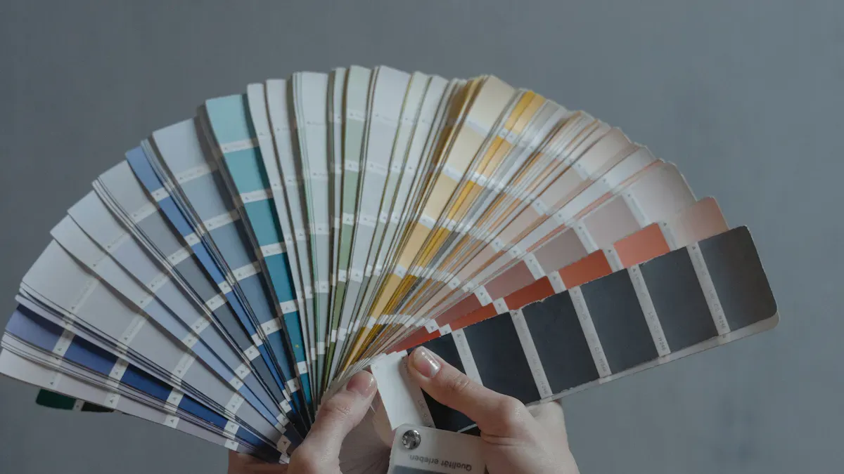
Industry measures color difference using Lab* and LCh color spaces, often with spectrophotometers.
Key Takeaways
Color difference, measured by Delta E, shows how much two colors vary. A lower Delta E means less noticeable differences.
Consistent color builds brand trust. Small color differences can affect customer perceptions and lead to product returns.
Understanding color difference can improve product quality and reduce waste. Accurate measurement tools help maintain color consistency.
Understanding Color Difference
Definition of Color Difference
You encounter color difference when two colors do not match exactly. Scientists and industry professionals use a measurement called Delta E (ΔE) to describe how much two colors differ. Delta E values help you understand whether a color change is visible to the human eye. The lower the Delta E, the less noticeable the difference.
Here is a table that shows how Delta E values relate to what you can see:
Delta E Range | Perceptibility Level |
|---|---|
Less than 1 | Not perceptible |
1-2 | Only perceptible under close scrutiny |
2-10 | Slightly perceptible |
11-49 | Perceptibly different, but still appear similar |
100 | Opposite/complementary colors on the color wheel |
You can also visualize these thresholds in the chart below:
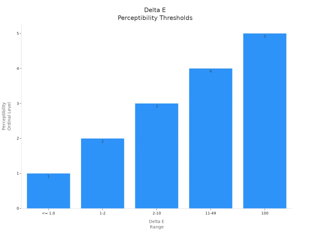
A Delta E value less than 1 means you will not notice any difference. Values between 1 and 2 are only visible if you look very closely. When Delta E reaches 2 or higher, you can spot the difference at a glance.
Why Color Difference Matters
Color difference matters because it affects how you judge products, brands, and even your daily experiences. In manufacturing, companies use color measurements to keep products consistent. If you buy a shirt and notice the sleeves are a different shade than the body, you might think the shirt is poor quality. This can lead to returns, wasted materials, and higher costs for the company.
Consistent color helps brands build trust. If you see a lighter bottle of ketchup on the shelf, you might question its freshness or quality. Companies work hard to avoid these issues because color difference can damage their reputation and increase waste.
A study from the Institute for Color Research found that 62% of your first impressions about a product come from its color. This means that even small color differences can change how you feel about a brand or product. Brands like Apple have changed their logos to reflect new identities, showing that color choices can shape how you view a company.
Real-World Implications
Color difference plays a role in many industries and affects your everyday life. Here are some examples:
In the automotive industry, seat upholstery color impacts how you feel about a car’s comfort and luxury. Interior textiles must match perfectly to create a high-quality look.
In product design, color choices affect how easy it is for you to read text or use an app. Good color contrast improves readability and reduces mistakes.
In branding, consistent color use helps you recognize a company and trust its products. If a brand uses different shades of blue on its website and packaging, you might feel confused or less confident in the brand.
You can see the effects of color difference in these situations:
Seat upholstery in cars must match to maintain a sense of luxury and quality.
Interior textiles, such as insulation, need consistent color for both appearance and comfort.
Safety materials rely on color for compliance and consumer trust.
Modular interiors use color flexibility to appeal to different needs.
Smart textiles use color to give you visual feedback.
Color also influences your emotions and decisions. Warm colors like red and yellow can make you feel excited or draw your attention. Cool colors like blue and green can help you feel calm. Brands use these effects to connect with you and encourage you to choose their products.
Psychological Effect | Consumer Behavior Impact | |
|---|---|---|
Warm Colors (e.g., red, yellow) | Create feelings of warmth and stimulation | Increase attractiveness and competitive performance |
Cold Colors (e.g., blue, green) | Induce relaxation and calmness | Decrease likelihood of postponing purchases |
Red Background | Higher bidding in auctions | Lower bids in bargaining situations |
When companies fail to control color difference, you may lose trust in their products. Consistent color helps you recognize brands and feel confident in your choices. This is why color difference is so important in design, manufacturing, and branding.
Measuring Color Difference
Delta E and Color Spaces
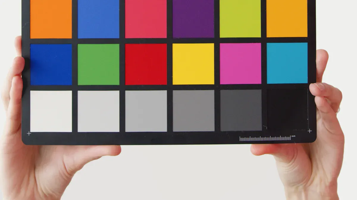
You can measure color difference using mathematical models called color spaces. The most common color spaces are CIELab and CIELCh. These models help you describe colors in a way that matches how people see them.
Color Space | Description | Components |
|---|---|---|
CIELab | A uniform color mode that separates lightness and color information. | L* (lightness), a* (green-red), b* (blue-yellow) |
CIELCh | A cylindrical representation derived from CIELab, focusing on lightness, chroma, and hue. | L (Lightness), C (Chroma), H (Hue) |
Calculation Methods
Delta E is the main formula for measuring color difference. It calculates the change in visual perception between two colors. You use the differences in lightness, redness-greenness, and blueness-yellowness. The formula squares these differences, adds them, and takes the square root. This gives you a number that shows how much two colors differ. Several formulas exist for different needs:
Formula | Perceptual Accuracy | Calculation Complexity | Primary Use Case |
|---|---|---|---|
CIE76 | Low | Low | Comparing legacy data, not for new QC |
CMC l:c | Good | Medium | Widely used in textiles |
CIE94 | Good | Medium | Graphics, paints, and coatings |
CIEDE2000 | Highest | High | The current standard for all industries |
You can use tools like Color Difference Calculator, Delta-E Calculator, and Delta E Calculator Tool. These tools let you compare colors in real time, support hex color input, and show visual previews.
Interpreting Results
You interpret Delta E values to decide if a color difference is acceptable. A value less than 1 means you cannot see any difference. Values between 2 and 3.5 are usually the limit for commercial products. If Delta E is above 5, the colors look very different.
ΔE≤1.0: Not perceptible by most people.
1.0<ΔE<2.0: Minor difference, visible only to a trained eye.
2.0<ΔE<3.5: Noticeable difference, often the commercial limit.
3.5<ΔE<5.0: Clear and distinct difference.
ΔE>5.0: Fundamentally different colors.
Industry Applications
You find color difference measurement in many industries:
Textiles: Ensures fabric colors match for quality and appeal.
Printing: Maintains color standards across batches.
Automotive: Matches parts for a seamless look.
Measuring color difference helps you control product color and keep quality consistent. This process supports brand integrity and meets customer expectations.
You gain many benefits when you understand and measure color in your work.
Color influences 85% of buying decisions and shapes first impressions.
Accurate measurement improves product quality, reduces waste, and builds brand trust.
You can find resources like FAQs, manuals, and learning centers to deepen your knowledge.
FAQ
What is Delta E in color measurement?
Delta E shows how much two colors differ. You use it to decide if a color change is visible or acceptable in your work.
What tools can you use to measure color difference?
You can use spectrophotometers, colorimeters, or online calculators. These tools help you compare colors and ensure product consistency.
What happens if you ignore color difference in products?
You may see mismatched items.
Customers might lose trust.
Product returns and waste can increase.
See Also
Key Features To Consider For Your Gaming Monitor
Essential Features To Look For In OLED TVs
The Impact Of BOE's BNL Technology On Displays